Nature Macro Photography Wall Art for Focused Work Areas
Nature Macro Photography: Quiet Focus for Heads-Down Areas
Heads-down areas live or die by what you see while you work. A wall that feels busy can pull your eyes away from the page, the screen, or the sketchbook. A wall that feels flat can make the room feel unfinished. Nature macro photography sits in a helpful middle space: it offers detail and texture, but it keeps the scene tight and contained.
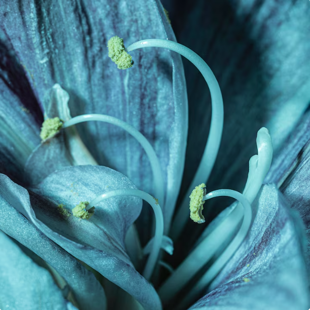
Macro nature images zoom in on small parts of the outdoors—leaf lines, petal edges, dew on a blade of grass, bark grain, or the curve of a seed pod. In a home office, study nook, or reading corner, those close-up views can act like a quiet visual anchor. You get something to rest your gaze on during short breaks without turning your work zone into a distraction.
Why Macro Nature Photography Works in Focus Zones
Contained detail instead of visual noise
Wide landscapes can be great, but they often include many points of interest. Macro photography narrows the frame. That narrow frame makes it easier for your brain to “park” on one set of shapes and return to your task.
Natural pattern and steady rhythm
Close-up nature often shows repeated lines and gentle curves. That repetition can feel orderly without looking strict, which helps when you want your workspace to feel steady.
Soft color, clear subject
Many macro nature photos lean on greens, warm neutrals, and muted tones. These shades tend to sit quietly in the background. If you want more energy, choose a macro print with sharper contrast and a clear subject edge.
Choosing Macro Subjects That Support Concentration
Before you pick a print, decide what kind of focus you want: deep concentration, calm reading, or light creative work. Then choose a subject that matches that pace.
- Leaf and fern close-ups for clean line work and a grounded look
- Flower petal details when you want softness without a busy scene
- Moss and forest floor textures for a quiet, low-contrast wall
- Dew drops and water surface detail for a crisp, clean point of focus
- Bark and stone textures for a neutral, work-ready background
If your workspace already has a lot of objects in view—shelves, tools, open storage—avoid macro images with many bright color blocks. A single subject with a clear background often reads best in a working area.
If you want a broad starting point, browse pieces that fit this theme in the nature canvas prints collection. Choose a print where the main subject is easy to spot from across the room, then enjoy the fine detail up close.
Where to Hang Macro Nature Prints in Heads-Down Areas
Placement matters as much as the image. You want the print to support your work, not compete with it.
- Behind your desk so the wall looks finished in video calls and feels settled when you turn around
- To the side of your main screen so you can rest your eyes for a moment without losing your workflow
- Above a reading chair to set a quiet tone for books, notes, or journaling
- Near a bookshelf to connect paper, wood, and natural texture in one visual line
- Over a small console or cabinet in a study corner to mark the zone as “work-ready”
A helpful rule: place the print where you see it when you lean back, not where it sits directly in the center of your most intense working sightline. That way it supports breaks, not interruptions.
Sizing and Layout That Keep the Wall Calm
Macro photography rewards scale. If the image has fine detail, a larger size can make the texture readable from a normal working distance. If your wall is small, a single medium piece can still work well if the subject is bold and clear.
- One large piece creates a clear focal point and keeps the wall from feeling busy.
- Two coordinated pieces can balance a wider desk wall, especially if both images share a similar tone.
- A tight set of three can work if each print is minimal and the spacing is even.
- Horizontal layout suits walls above desks, consoles, and low shelves.
- Vertical layout fits narrow walls, corners, or the space beside a tall bookcase.
Leave breathing room around the print. In a heads-down area, empty wall space is not wasted space; it helps your eyes stay relaxed.
Color Choices for Focus: Calm, Crisp, or In-Between
Muted greens and warm neutrals
If your goal is steady concentration, look for greens, soft browns, and gentle grays. These often pair well with wood desks, light walls, and warm lamps.
Black-and-white macro photography
If you like a sharper look, black-and-white macro images can feel clean and structured. They also pair well with most furniture finishes and keep the room from feeling color-heavy.
One accent color, not many
If you want a little energy, pick a macro photo with one clear accent—like a single bright petal edge—rather than a mix of many bright tones.
Styling Macro Nature Wall Art Around a Workspace
Match materials, keep objects quiet
Macro nature prints look at home near natural materials: wood, linen, wool, matte ceramics, and simple metal accents. Keep desk objects limited in number so the art has room to “sit” on the wall without competing with clutter.
Light the print without glare
Try soft, even lighting. If your workspace has strong daylight, avoid placing the print where sunlight hits it at a harsh angle. A gentle lamp behind or beside your desk can help the detail read well without shine.
Let the art set the tone for the zone
Macro nature photography can define a work corner, even in a shared room. If you want the area to read as a true workspace, pair the print with clean storage and a consistent desk setup.
For spaces where you want a more work-first look, you can also blend macro nature with clean professional themes from the office wall art collection. This mix works well when your room needs to feel focused during the day and restful after hours.
A Quick Buying Guide for Macro Nature Wall Art
Step 1: Decide your “focus mode”
Do you want a quiet background for deep work, or a crisp image that gives you a quick reset between tasks? Pick your contrast level based on that answer.
Step 2: Match the print to the wall’s job
Desk wall: choose a clear subject and steady tones. Reading wall: softer edges and gentle detail often work well. Creative wall: slightly stronger contrast can help you feel alert.
Step 3: Choose a size that reads from your seat
If you sit far from the wall, go larger. If the wall is close, a medium print can still show detail without taking over the room.
FAQs: Nature Macro Photography for Heads-Down Areas
1) What is macro nature photography in wall art?
It is close-up nature imagery where small subjects—like leaves, petals, and textures—fill the frame and show fine detail.
2) Is macro photography too detailed for a work area?
Not if the scene is contained. A single subject with a clean background usually supports focus better than a busy scene.
3) Where should I hang macro nature prints in a home office?
Good spots include behind the desk, beside the monitor wall, or above a cabinet in your work corner.
4) Should the print be directly in my line of sight?
Many people prefer it slightly off-center so it becomes a “break view,” not a constant pull during deep work.
5) What size works best above a desk?
Choose a size that feels balanced with the desk width. Wider desks often suit horizontal pieces or a paired set.
6) Is black-and-white macro photography good for focus?
Yes, it can be a clean option when you want detail without color. It also pairs easily with most furniture finishes.
7) What colors are safest for a study nook?
Muted greens and warm neutrals often feel steady. If you want more energy, pick one clear accent color, not many.
8) Can macro nature art work in a small room?
Yes. One clear subject can make a small wall feel finished without adding clutter.
9) How do I pair macro nature prints with shelves and storage?
Keep shelf objects limited in number and repeat one or two materials (wood, matte ceramic) so the wall stays calm.
10) What frame style works well with macro nature images?
Neutral frames and clean edges work well. If you prefer canvas-style presentation, keep surrounding items minimal.
11) Can I mix macro nature with other themes in one workspace?
Yes. Keep the color range consistent so the wall reads as one plan, not many competing ideas.
12) How many pieces should I hang in a heads-down area?
Often one or two pieces are enough. If you choose three, keep each image minimal and spacing even.
13) What’s the best height for hanging a macro print near a desk?
Place it so the center sits near eye level when you are standing, or slightly lower if the desk and chair are the main viewing point.
14) Can macro nature art help reduce screen fatigue?
It can help as a resting point for your eyes during short breaks, especially if it is placed slightly off to the side.
15) How do I keep the wall from feeling busy?
Use one main piece, keep nearby objects limited, and leave open wall space around the print.